
ABOUT
Watson Studio (previously called Data Science Experience) is a tool for data science teams to collaboratively work with data, create machine learning models, and operationalize these models in production environments.
What was my role?
Depending on the squad, I switched between research and design work. In regards to my design specific work, I was responsible for creating designs to help data scientists monitor model performance and compare models in production.
My Team: Watson Studio Design Team, ML and & Team, Hybrid Cloud Design Organization
Tools: Sketch, InVision, Keynote, Pen & Paper
Impact: My design work helped the experience and functionality for nearly 80k monthly active users.
context
Creating the next data science experience.
Data science is a constantly growing and evolving field. After talking to users and analyzing the competitive landscape, we learned that the workflow doesn’t just end when a model is created and deployed. Models need to be monitored and updated frequently to make sure that it best services users.

Our product strategically evolved to support data scientists after they created their model. This includes what we call the “deployment workflow” — the process of sharing models live to the world.
Monitor Predictions and Compare Models
Machine learning models are difficult and time-consuming to maintain. Unlike regular code, models change over time. They are continuously learning and challenged as new data comes into the model. Because of this, data scientists need monitor how models evolve and compare them to other potential models.
Our target persona is the Data Scientist. Part of their goals and tasks depend on optimizing and improving models for the business.
To help a data scientist monitor and compare their models, we had the task of creating an experience that:
Helps data scientists monitor how their models have changed over time
Provides the right information, in the right format, to make decisions about which model is working best
On a squad of 3, I helped design the new functionality to help data scientists monitor and react to their model’s performance.
process
Understanding assumptions from development.
When the project was started, design and development both understood that monitoring and comparison capabilities were real needs for data scientists. However, development already assumed a specific way for data scientists to compare models.
We spent time as a design squad trying to understand why development held certain assumptions about the comparison workflow and how these assumptions impacted their proposed workflow.

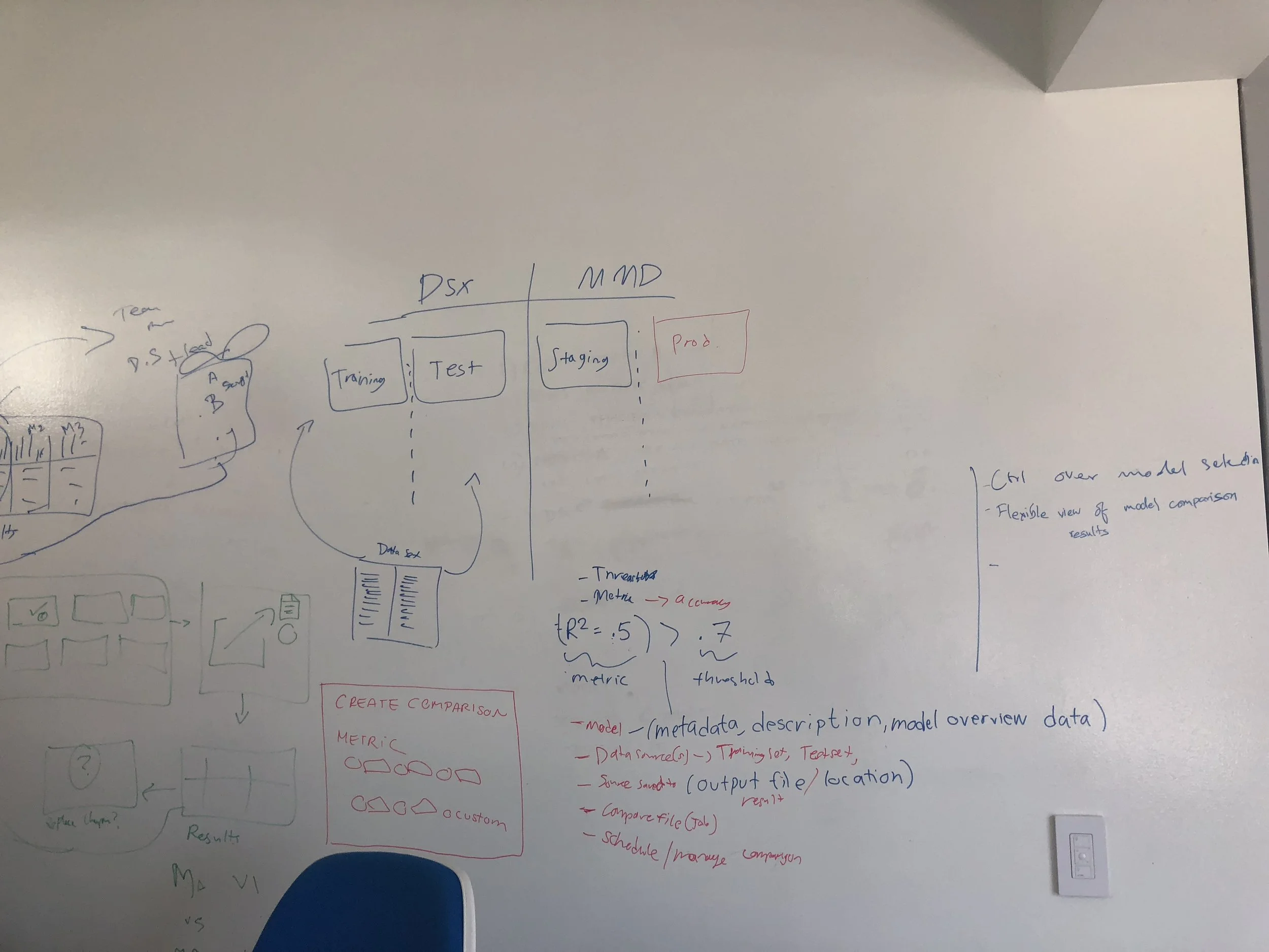
We created many diagrams to document our understanding of the technical domain and have an artifact to facilitate conversations with development.
In doing this work, we learned that development assumed:
Data Scientists prefer to schedule comparisons.
Data Scientists prefer to compare only versions of the same model to one another.
Data scientists have specific thresholds and expected behavior in mind when choosing models to compare.
Understanding real user workflows and testing development ideas.
With an understanding of our developer’s assumptions, we tried to translate some of these requests and document our own thoughts of in various paper sketches. We decided to test these sketches with internal data scientists to see which ideas made sense.


Previous research efforts taught us that data scientist monitored models for performance, business value, and computational efficiency. Building off this work, we tried to understand the steps and tools they used to actually get this information. We recruited 5 data scientists for 1 hour long sessions comprised of interview questions and concept testing with paper sketches.
Based on this work we learned to create a good experience:
Comparisons are limited by how often new data is available. Users can need to schedule evaluations based on when data becomes available.
Data scientists compare different types of models, not just versions of the same model.
Determining what model is “the best” is a nuanced process, requiring a lot of metrics and information.
Initial explorations
Our initial explorations focused on creating an easy way to select models for comparison, visualizing information to compare models, setting up schedules and configurations.
As a team, we came up with various designs to bring these ideas to light. After comparing, removing, and combining ideas, we converged our designs into a a single workflow.


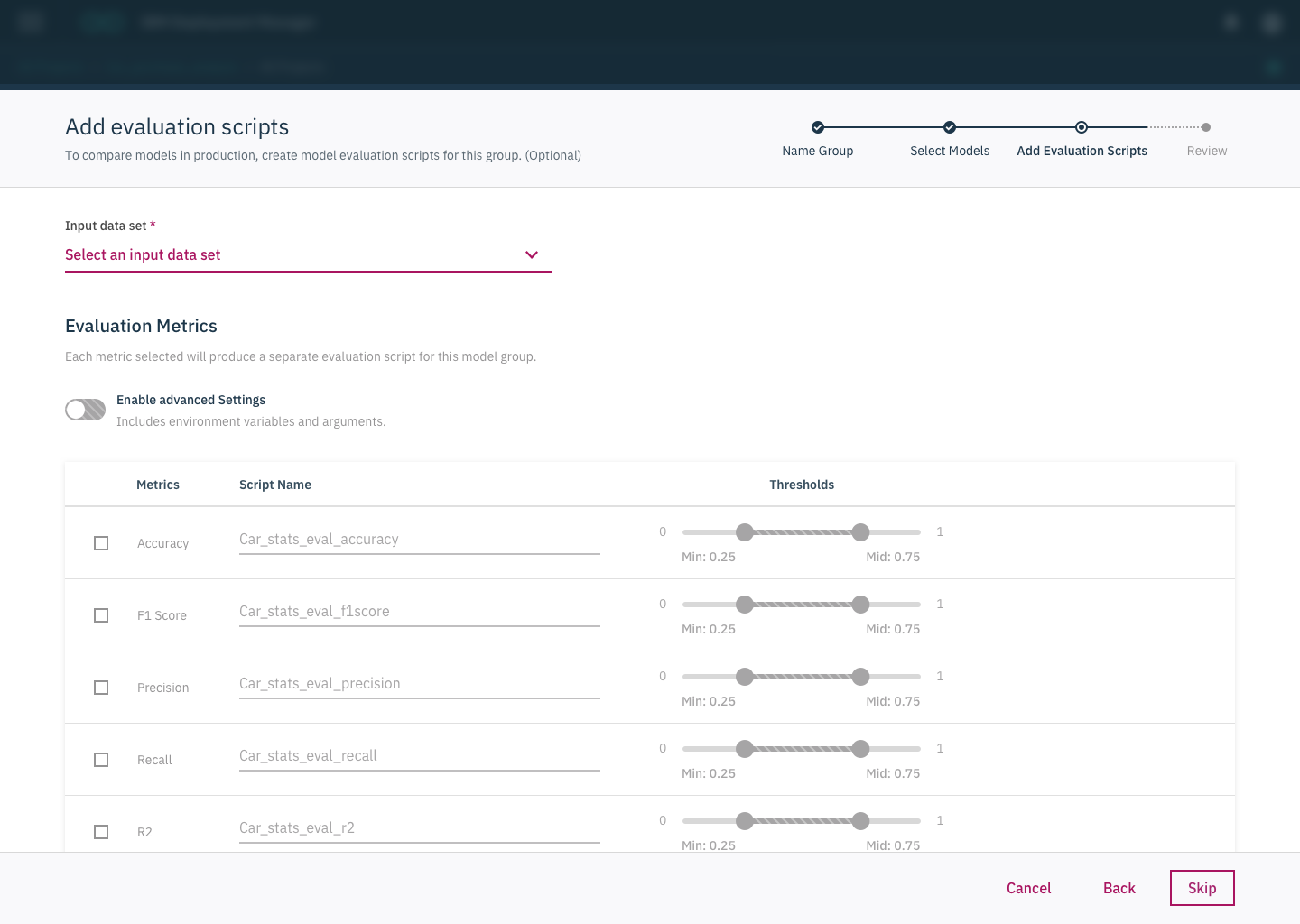
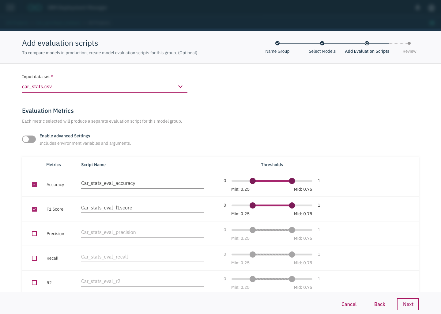
In our first attempt at creating designs, we tried to help users through the experience by making the set up process into a wizard flow, with the intention of segmenting steps and reducing confusion.
These designs were shipped in the on-premises version of our product.


We tested our designs with 6 different users. In doing this testing we learned that:
Its commonplace to compare models, but its often done in an ad-hoc manner
Users don’t select metrics or have strict thresholds ahead of time
Some users didn’t even understand thresholds meant in this context and had trouble setting them up
Users were frustrated by the constraints on selecting models. Often times they didn’t realize why there were in place
To act on this feedback we realized we had to:
Consider a faster and less structured way of creating comparisons
Reconsider the actual UI interactions with thresholds and the actual concepts behind them
Help the users understand the constraints in place for selecting models to select the right ones
final design overview
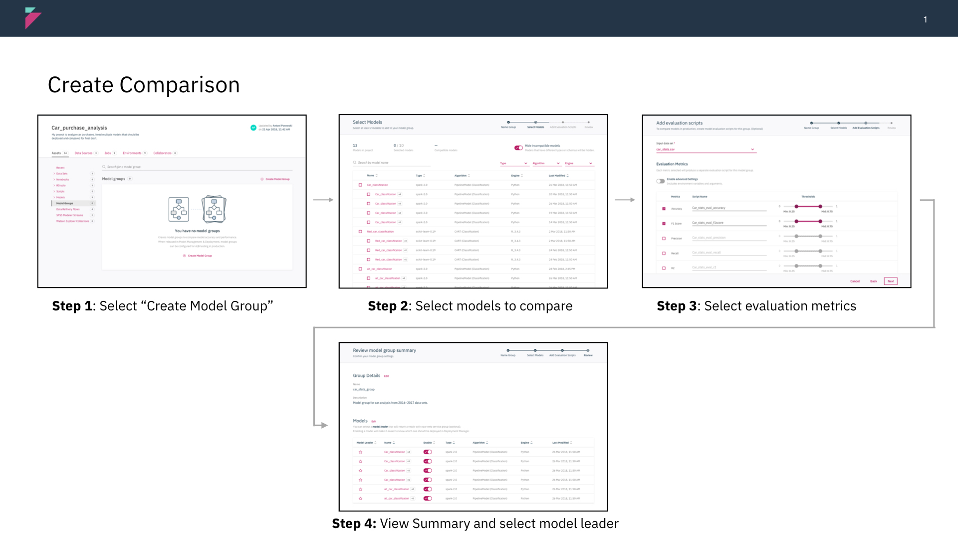
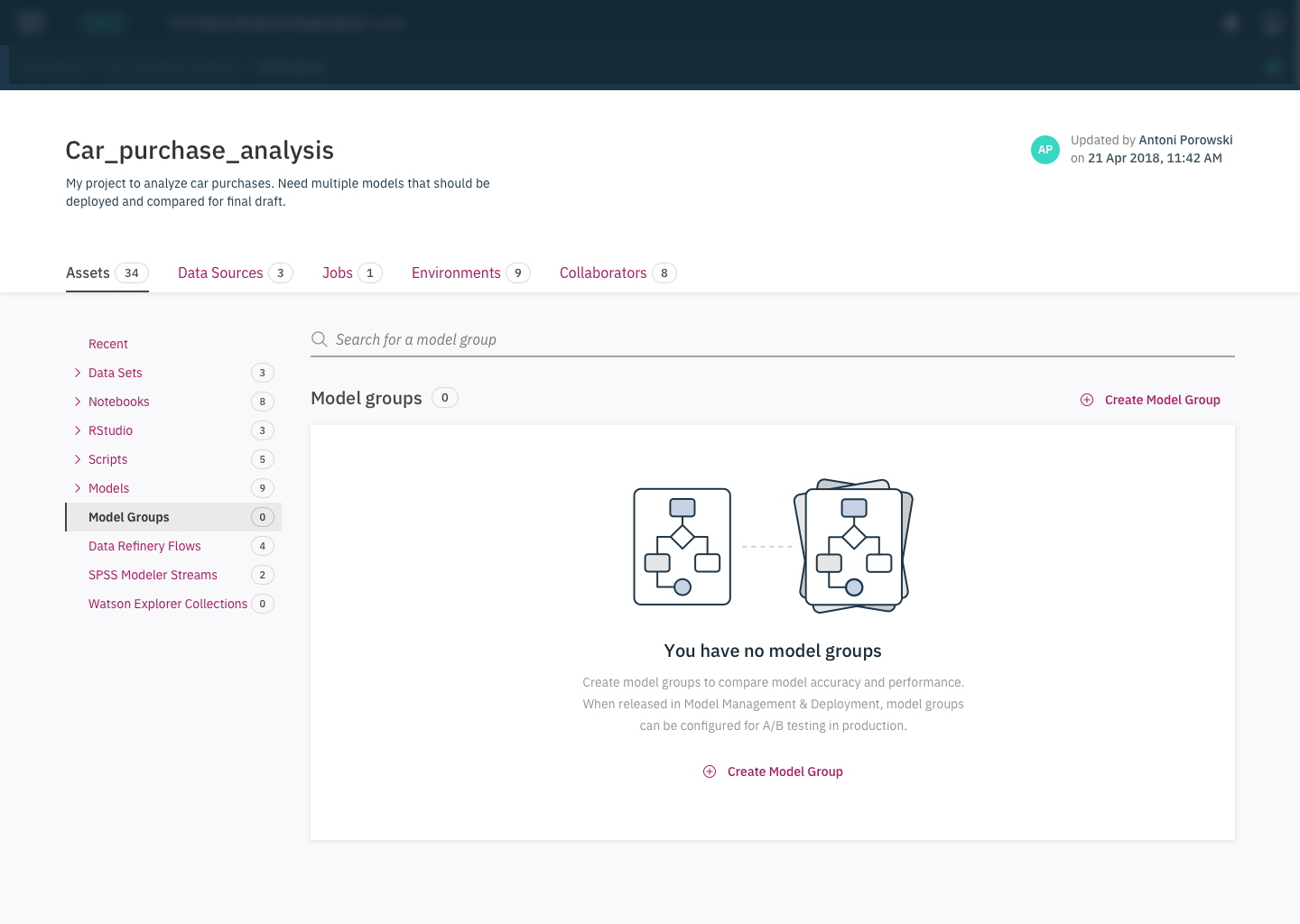
Simplifying the creation flow from a long wizard to a single screen.
In out initial designs, we were constrained by development to include many steps such as selecting models and creating evaluation scripts up front. After testing with users, we found it in their benefit to simplify this flow. After a re-org, we were able to introduce a new pattern that forwarded more information on a single screen, rather than relying on long pages or wizards.
Helping the user understand what they can actually compare.
Users expect that they can compare any models that they to each other. Because of technical constraints, we could only allows users to compare models with similar features. Based on testing we learned that the previous iterations designs did not give enough information to explain why models had to be compatible.
Previous iteration utilized a toggle button to hide models that were not compatible. Users did not notice the toggle and wanted more information as to why only certain models could be selected.
After removing a technical constraint and working with development, we were able to provide specific feedback to the user, explaining what criteria needed to be selected for models.
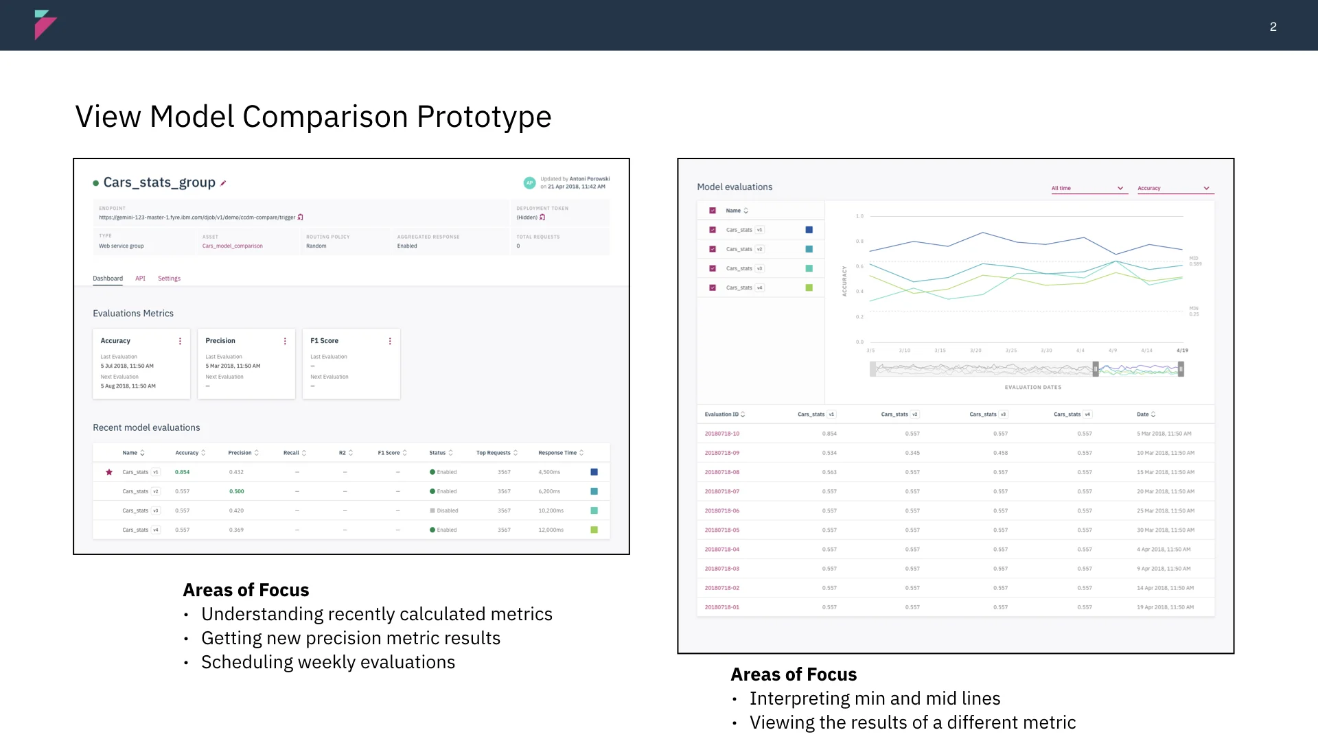
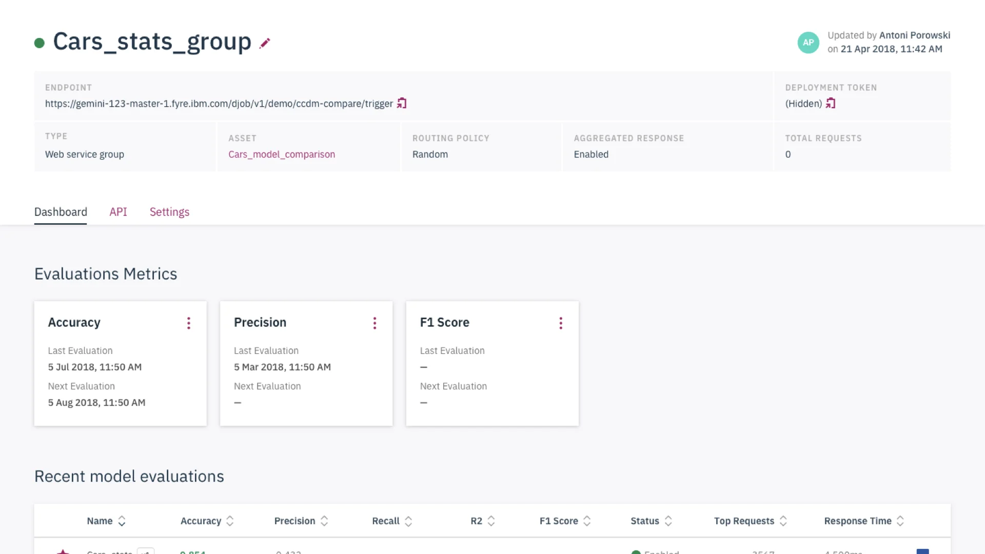
Selecting models for monitoring and comparisons.
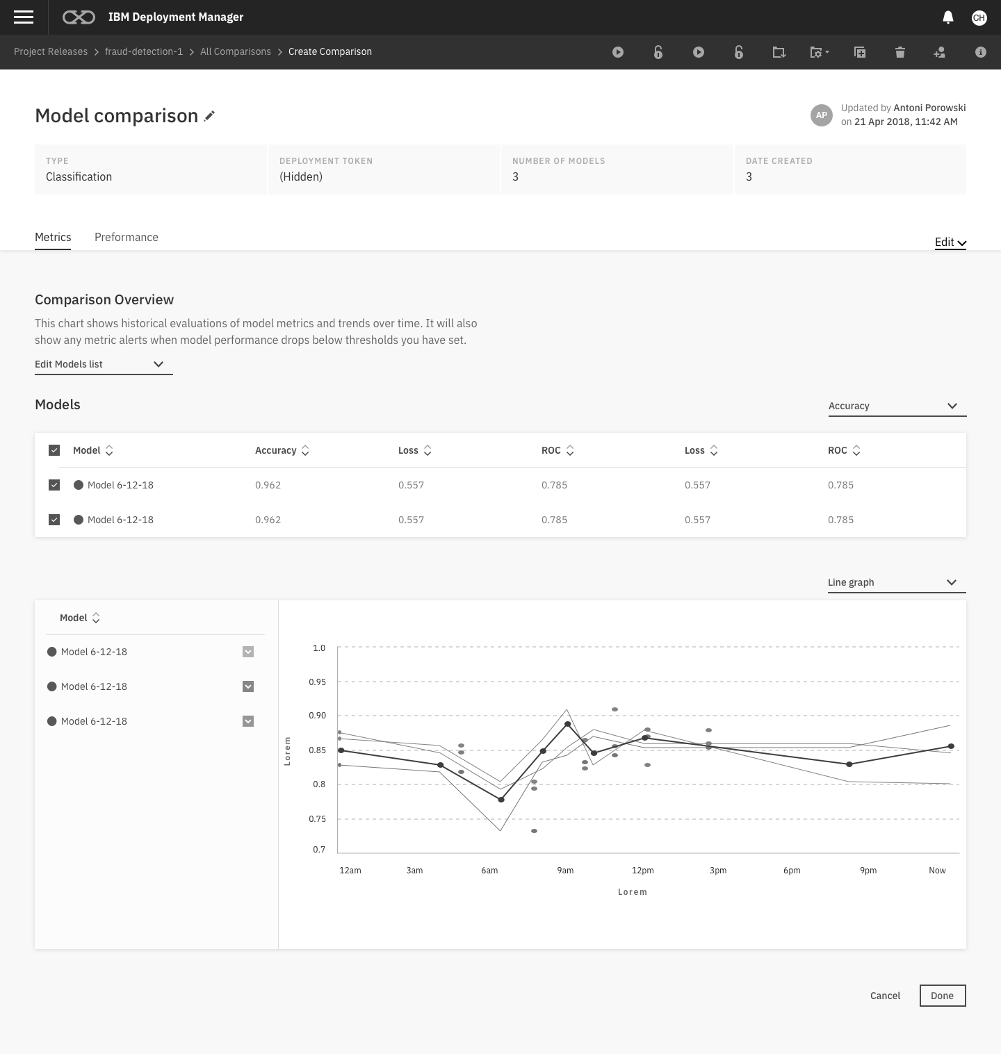
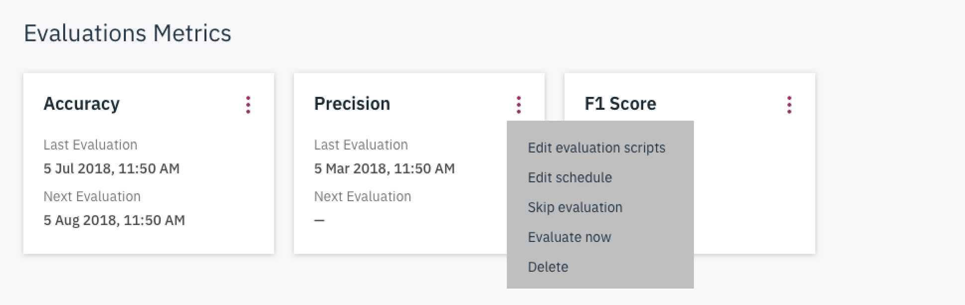
Making information actionable
The main outcomes of monitoring are to review, retrain, and deploy models. With this in mind, we tried to surface these actions next to relevant information to act upon monitoring. We also provided text and information to summarize the behavior of models, rather than providing cards with just meta-data.
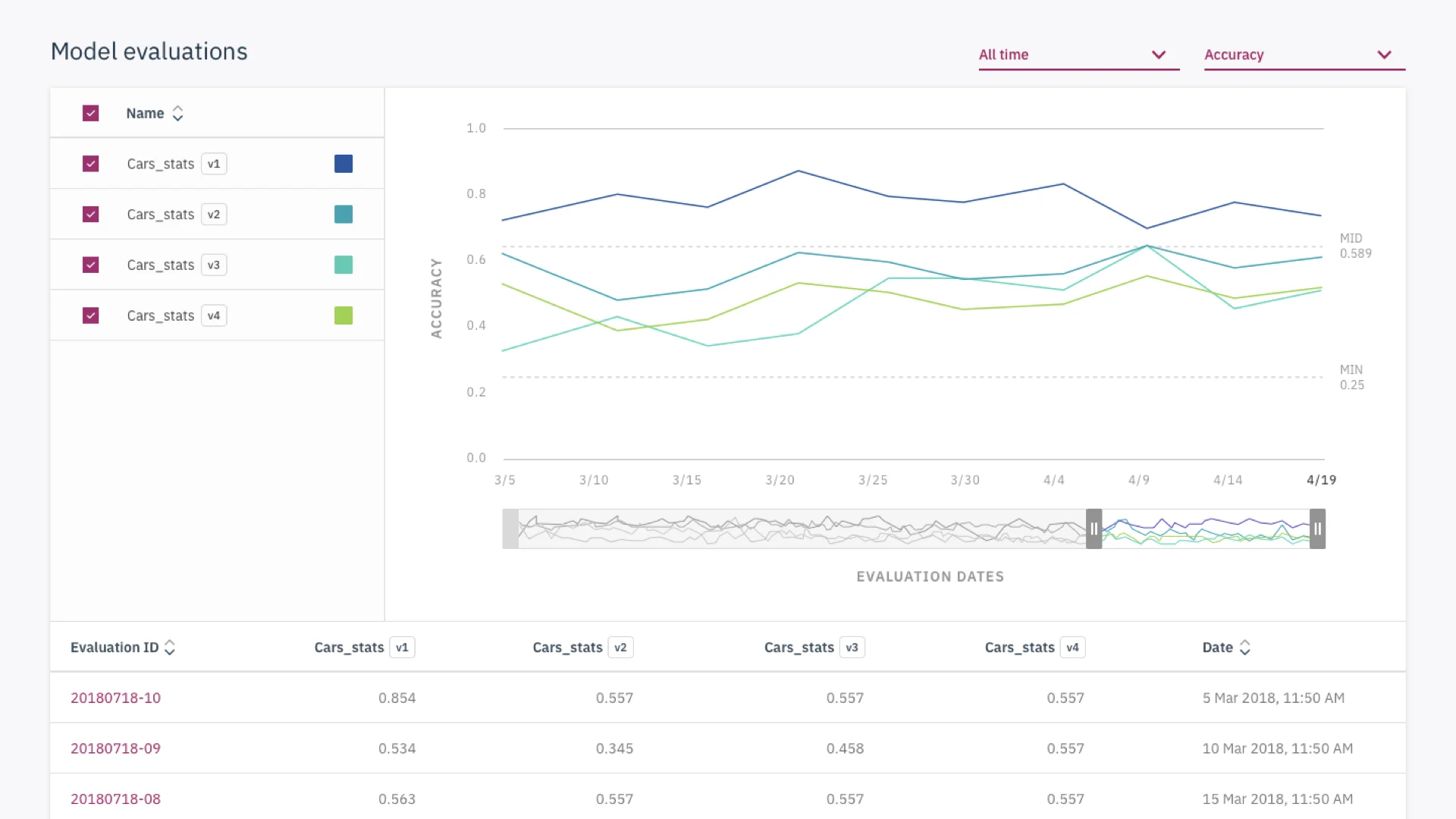
In our initial designs, we struggled to find the right visualization for data scientists to view multiple metrics at once. Finding inspiration from d3.js, we introduced parallel coordinates graphs as a way to compare multiple metrics and their relationship to one another.
Status
Our development team is currently in the process of shipping these designs to our cloud and on-premises version of our product. During this process we learned that it will not be possible to provide smart insights in our call to action cards. We plan to keep information about recent evaluations and keep our key actions prominent for users.
If we can conduct more usability tests we intent to measure these designs with net promoter scores and system usability scale.
Reflections
The major challenges we faced were:
Familiarizing ourselves with a comparison and monitoring workflow
Aligning as a squad on what flow made the most sense
Understanding assumptions from our development team
Working with development to prioritize needs and understand technical constraints