ABOUT
Watson Studio is a tool for data science teams to collaboratively work with data, create machine learning models, and operationalize these models in production environments.
In addition to my product focused work, I led a variety of design initiatives to improve internal product team processes.
CONTEXT
The original data science experience.
In its initial iteration, the focus of Watson Studio was as a place to gather data science tools in a central place, encourage collaboration between data scientists, and support model development and iteration.
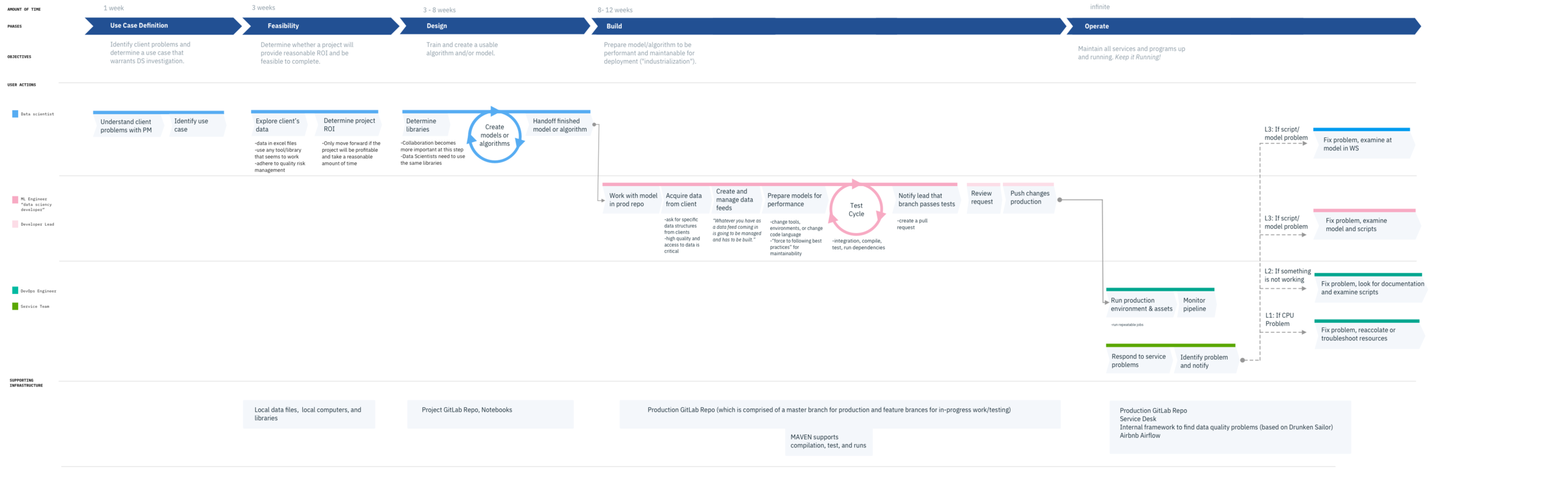
Previous understanding of the data science workflow flow.
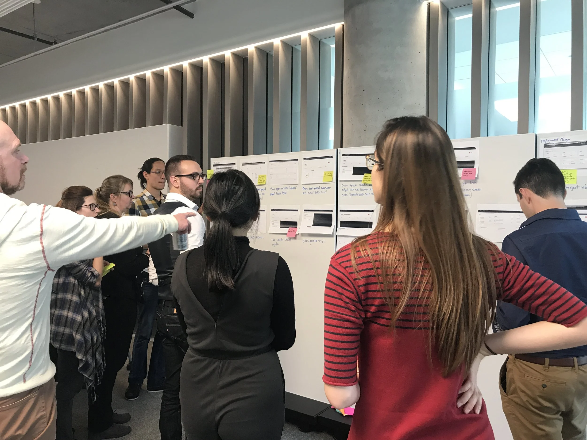
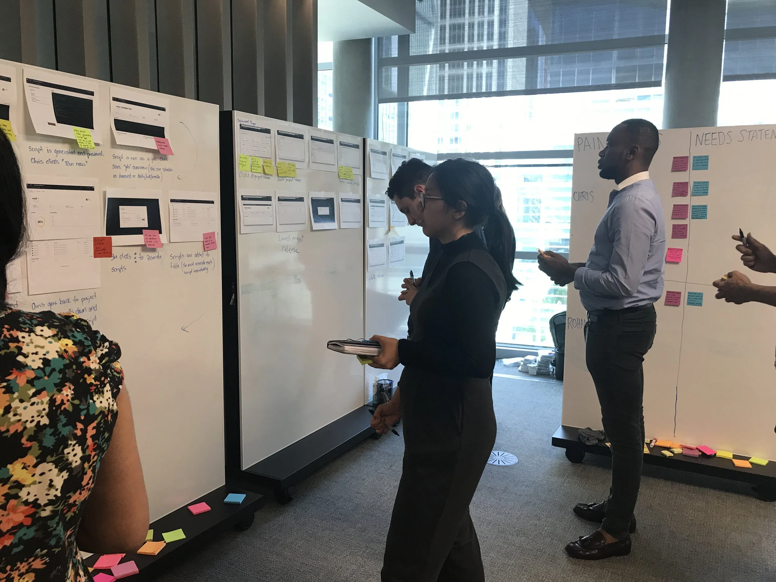
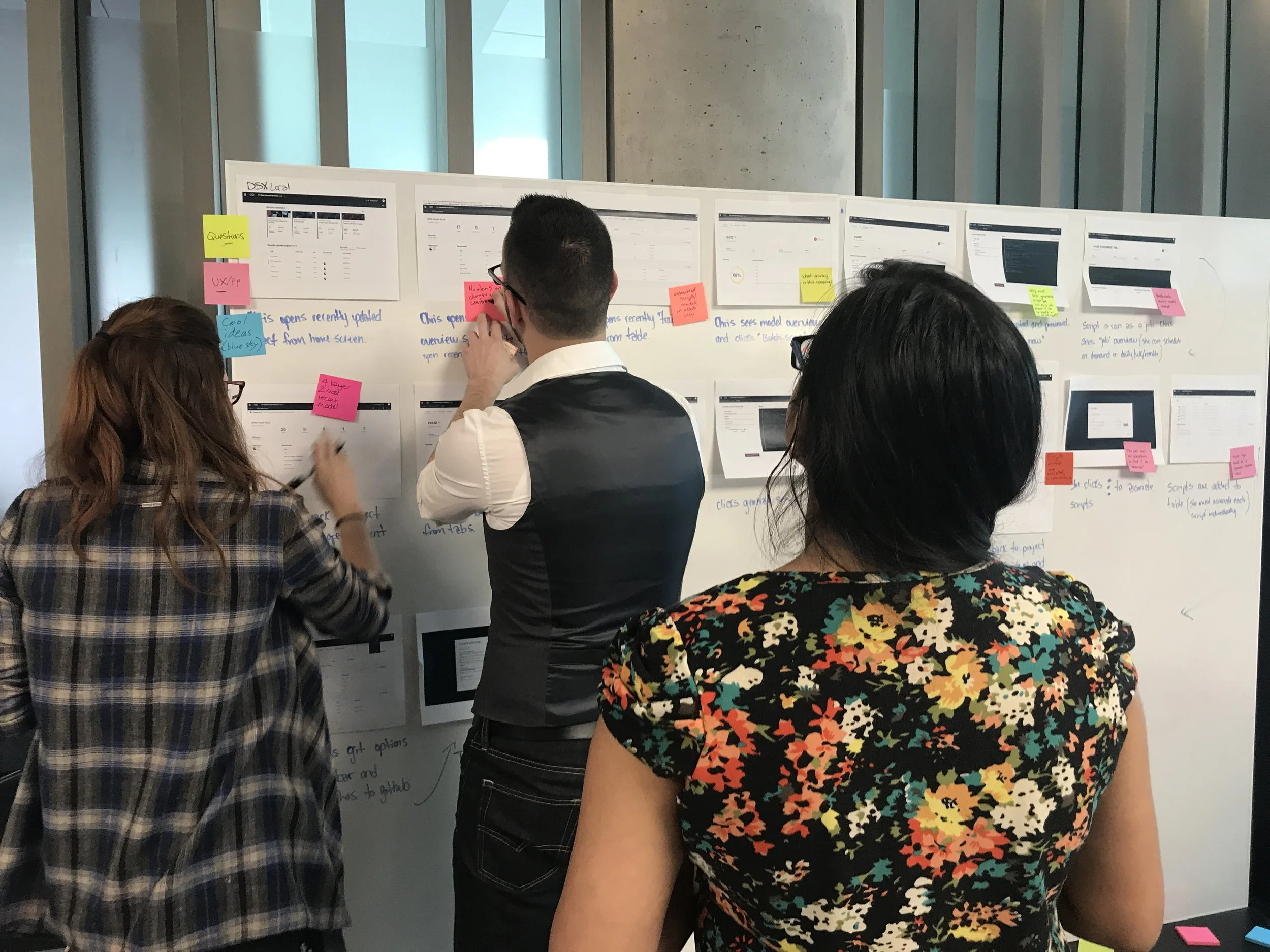
Creating the next data science experience.
However, data science is a constantly growing and evolving field. When I joined the team, our priorities focused to support data scientists in productionizing their models — that is, sharing finished models and observing the behavior of models in real use. This new workflow required deeper investigation into deployment and the integration of new tools and micro-services into our product.
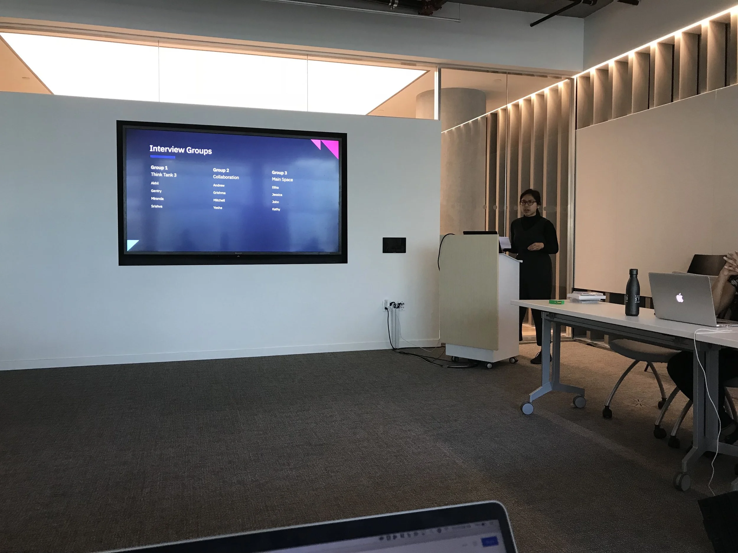
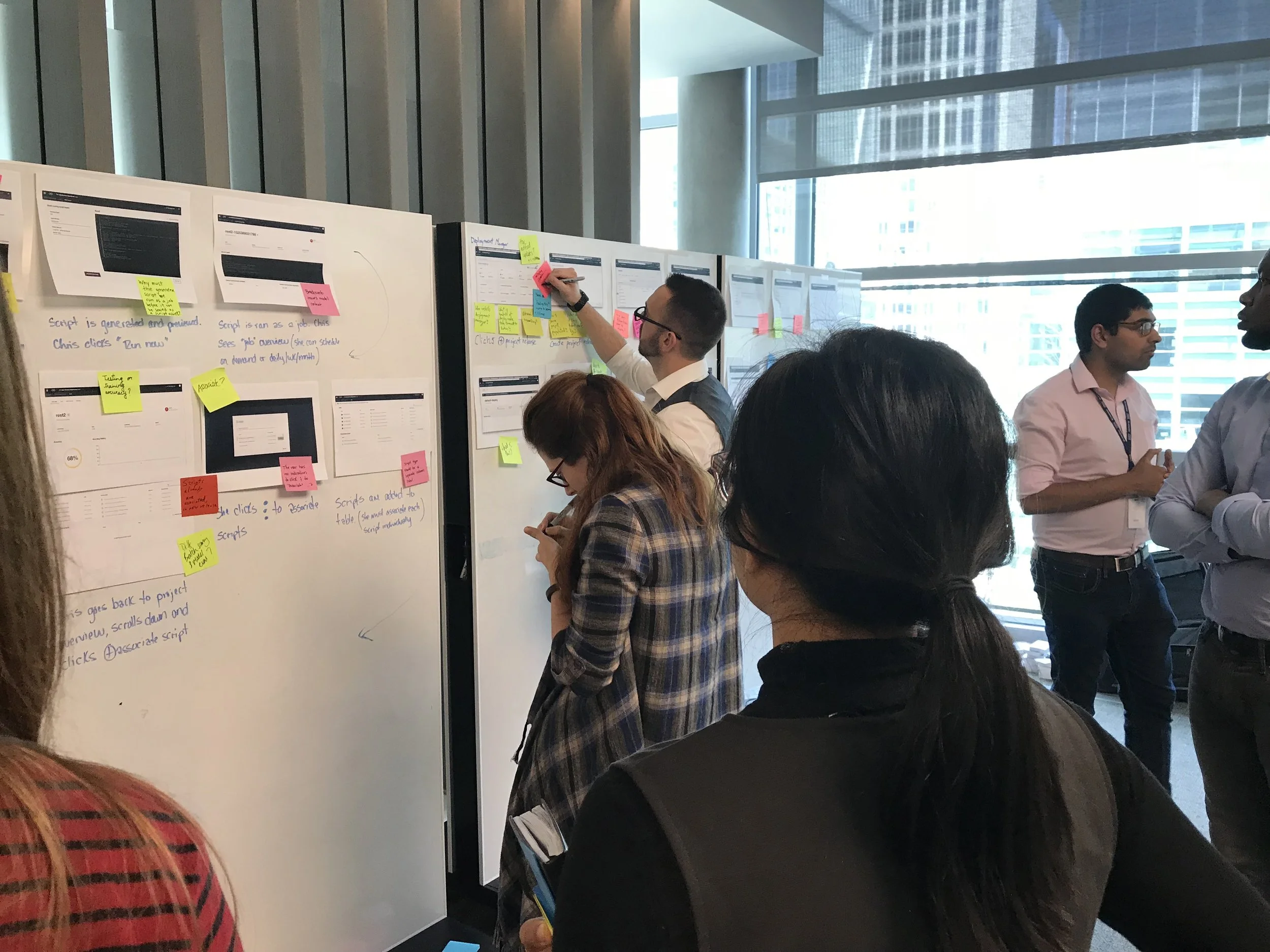
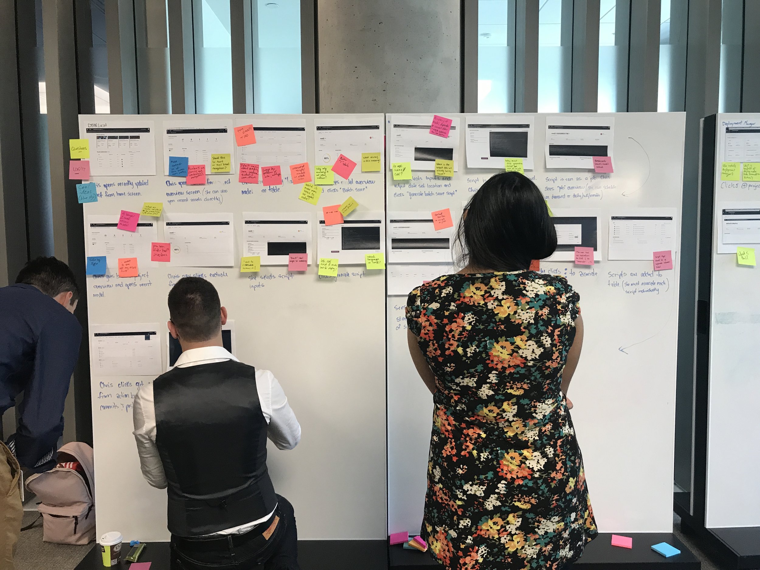
I helped synthesize insights from user interviews and documented our findings in visual artifacts for the team to refer and contribute to.
Updated understanding of the key roles and relationships between our users.
PERSONA DEVELOPMENT & VALIDATION
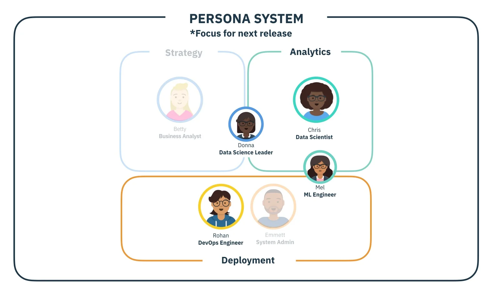
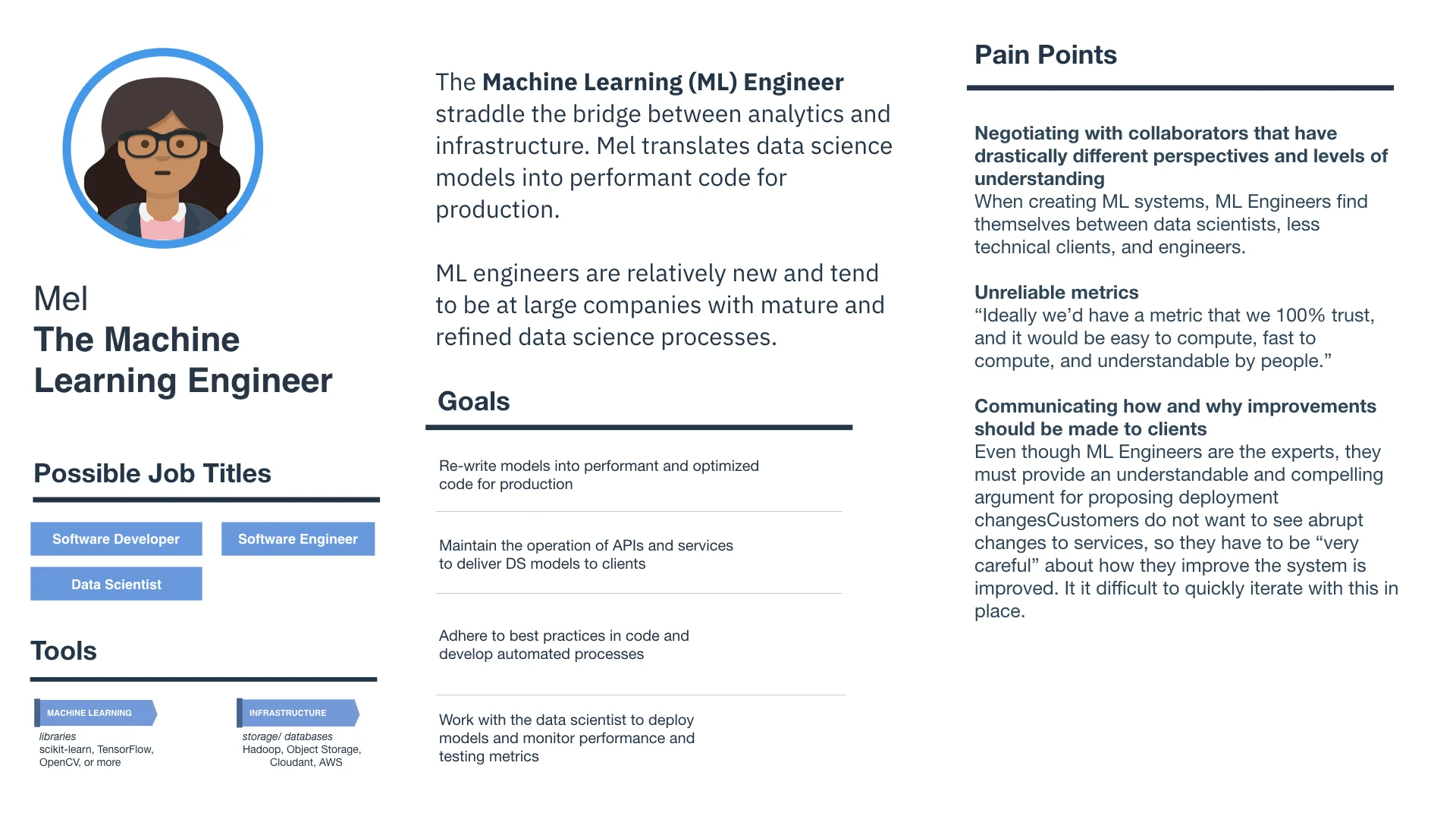
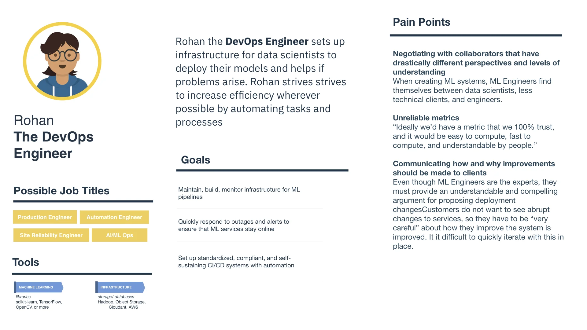
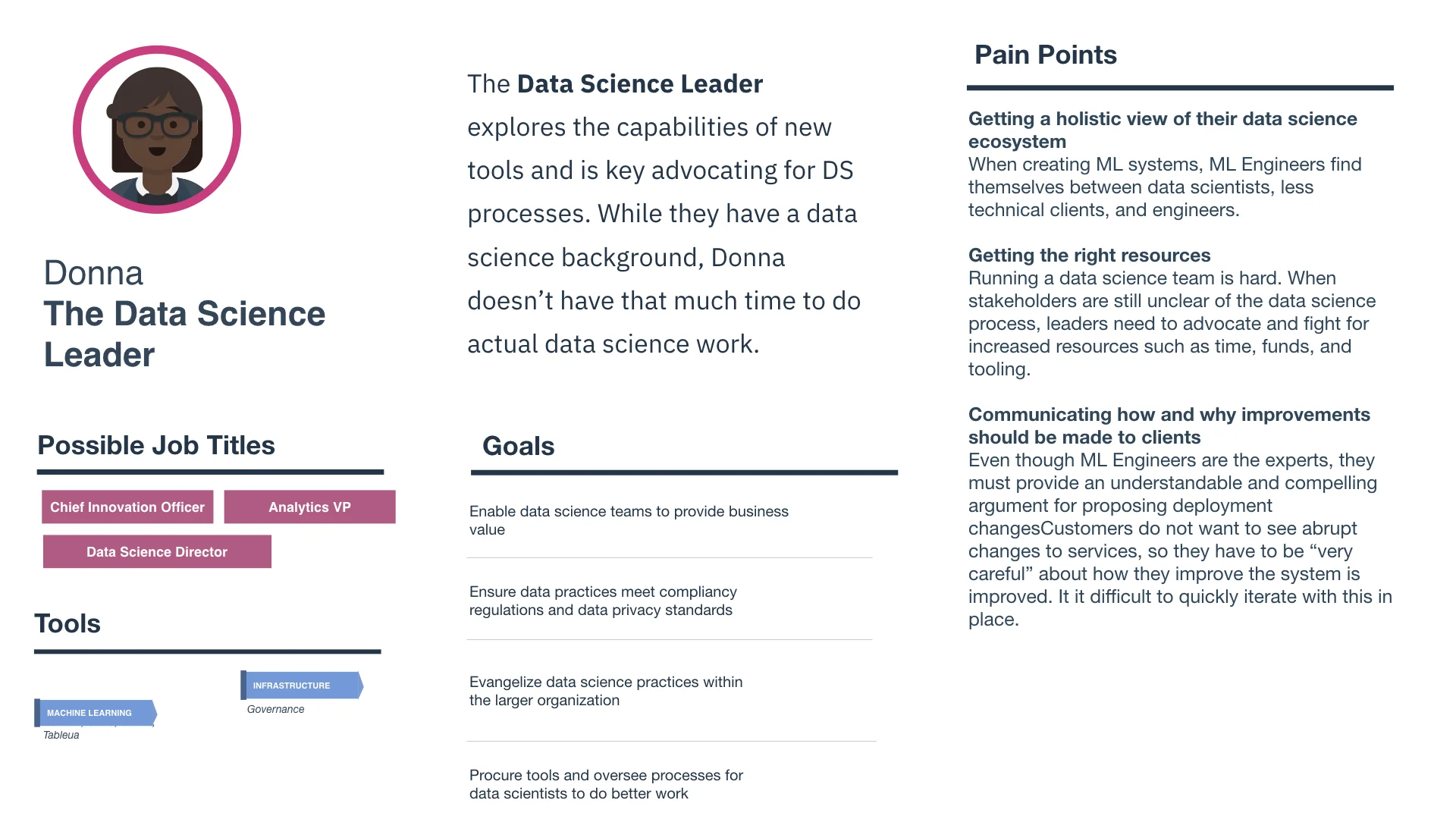
I contributed to our organization’s suite of personas by refining the Data Science role and developing three brand new personas: the Machine Learning Engineer, the DevOps Engineer, and the Data Science Leader.
Most of these roles are emerging roles that coincide with data science becoming a more mature field with new, specialized roles.
The personas were used to align design, development, and product management. As the data science field evolves, we will continue to refine and adjust these personas.
Tying design to business success
A move towards more data and customer driven design
In alignment with IBM’s corporate wide adoption of Customer Experience (CX) metrics, IBM’s design organization began holding designers responsible for tracking and improving these CX metrics.
PROBLEM
While the organization aspired to shift culture towards a more customer centric practice, self-reported frustration and observed confusion from designers within the organization revealed that:
Most designers were unfamiliar with what these metrics were and how to use them
Designers with understanding struggled to use metrics in a productive way -- using metrics to directly drive and assess design decisions
To address these problems, I worked with a large team of 20 designers to brainstorm solutions for these problems.
With this in mind, I worked with a cross-functional team to:
Introduce teams to a mix of self-service and structured education
Cultivate CX expertise and understanding within a product team and between product teams with shared artifacts and meetings
Establish more standardized practices of analyzing CX metrics and acting upon those insights
Creating a relevant, shareable NPS artifact
After aligning on higher level goals as a team, I led efforts on my immediate product team to document user journeys and ways that our product team collected NPS and other customer experience metrics. To summarize this work, I created a customer experience journey map to share with the team.

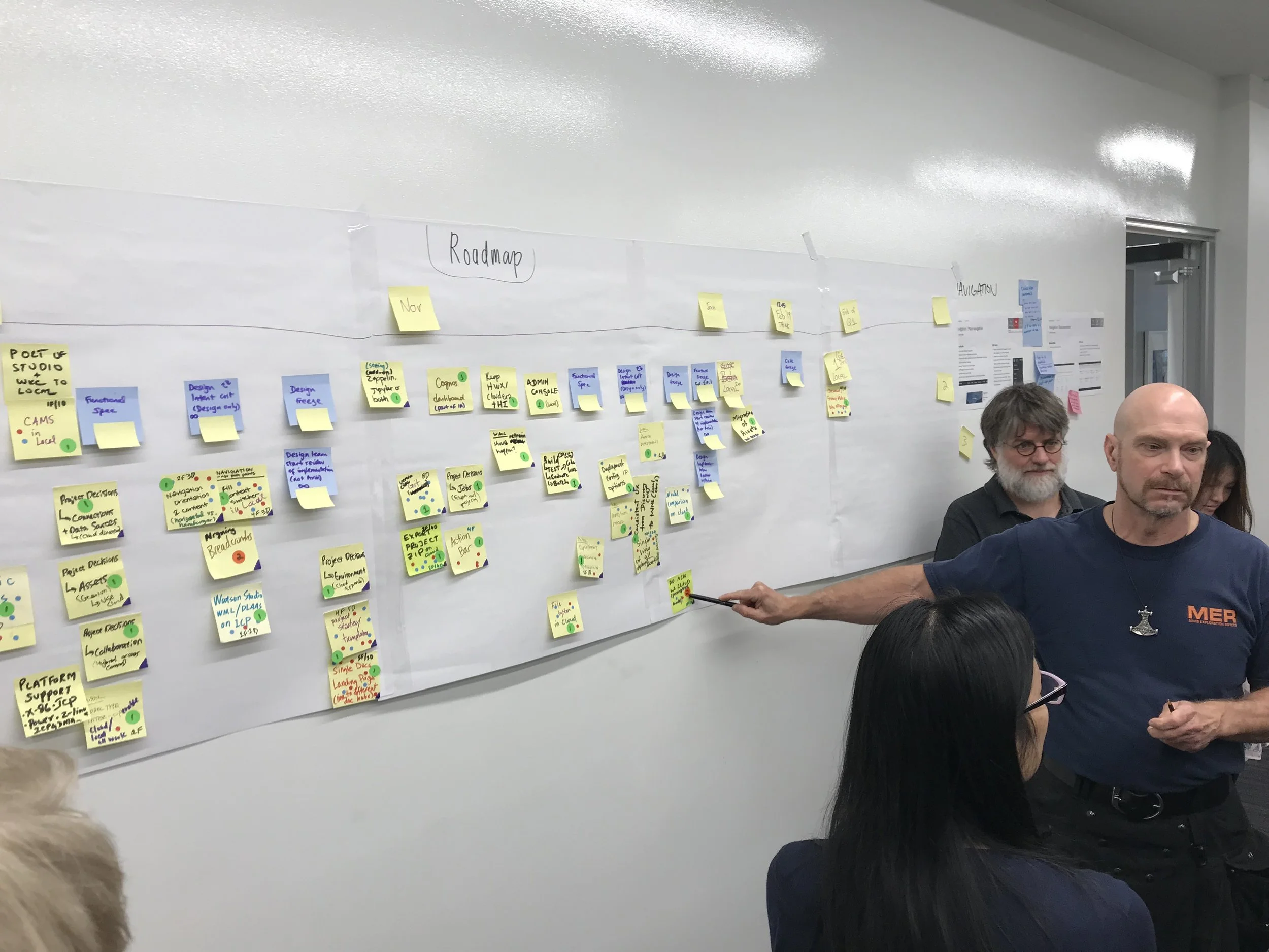
Prioritization of initiatives and problems from a remote workshop

Example of a Customer Experience (CX) journey and the different sources of data along the way.
In constructing the journey map and exploring the data tools used within our product team, I realized that design had very little visibility and understanding of all the data collected through a typical CX/UX journey.
By speaking to designers on my product team, I learned that all designers on the team (other than our design lead) could not answer:
What is NPS?
What is our current product NPS Score?
What is a good NPS Score?
How does our product compare to competitors?
What does our team to do track address NPS?
With this in mind, I tried to come up with a solution with the goals of:
democratizing access to NPS and CX data
producing a portable and sharable document for an entire team to document their shared understanding
make NPS more relevant with other sources of data
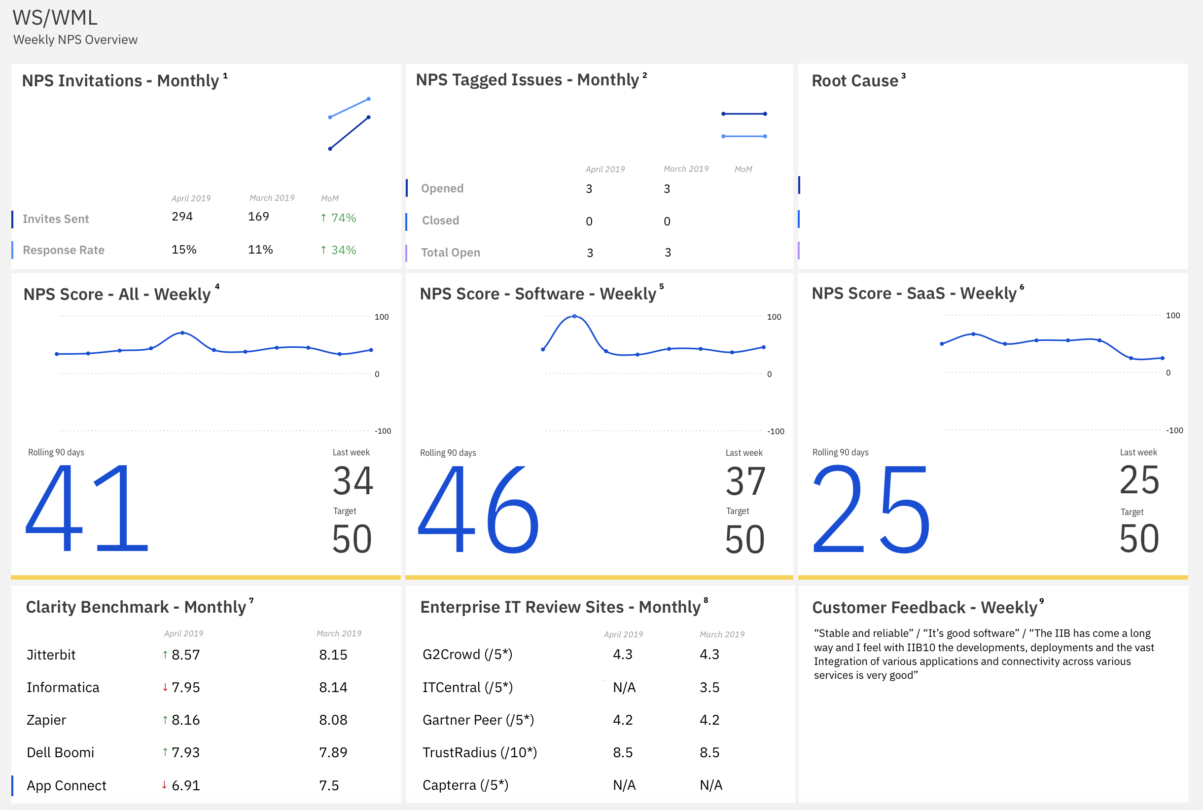
Proof of Concept for a new NPS dashboard
I created a proof of concept using Excel and Pages to create a dashboard view of different NPS and CX data. The goal of this view is to answer questions such as:
How reliable is our NPS data?
What is our current NPS Score and how does it align with our team goals?
Who are our product competitors?
As a product team, how are we responding to NPS issues?
How does our product compare to its competitors?
Team adoption of NPS artifacts
After creating an NPS dashboard proof of concept, I’ve gotten support from my team and from my organization to build this tool out. We’re still in the process of fully adopting this artifact. In the meantime, our designers have acknowledged that they have a better understanding of what NPS is and how our team tracks it.
I intend to refine the design of this dashboard and share it with the rest of the organization.
Workshops & Facilitation
I co-lead a number of workshops for both internal stakeholders and external clients. While the context and nature of these workshops differed, I had the opportunity to improve leadership skills, engage non-designers with design activities, and interact with all of these important people on my team in a new and engaging way.
Stakeholder Design Workshops
I organized meetings and workshops with stakeholders to review designs and strategize over larger scale product changes/roadmaps.
Client Meetings
I planned and led meetings with clients such as Deloitte and Blue Cross Blue Shield to gather feedback on designs and concepts. I created workflow diagrams to document this work and found opportunities to directly change and prioritize designs with client help.